Monday 31 December 2012

Game Engines


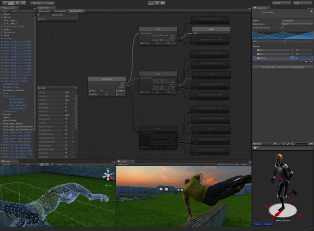
So all those pretty games we play are all developed within game engines, they bring together all the elements of a game such as art assets, animation, AI, GUI, sound, networking and programming and they make the final product you play. They’re pretty cool things.

 But…

Game engines are Marmite.

I think no one will deny the fuzzy warm feeling of accomplishment you get when you get your model running in engine, and you know that’s exactly how it’ll look in a game. And then having the ability to run around you model and shoot at it is great. Love it.


Bliss

But to get to that point is like climbing a mountain in a wheelchair. The interface of these engines is so confusing, loaded with icons and words left, right and centre. After importing your model its then a game of problem solving trying to figure out why this and that doesn’t work and why you’re getting error messages nonstop,  nothing ever runs smoothly. Hate it.

There are many game engines on the market to pick from, from hobbyist, to indie, to professional. But I’m going to focus on the three main engines on the market (UDK, Cryengine and Unity) and list the pros and cons of each.

UDK


The biggest player out of the three, also been round the longest.

Games using UDK : Gears of war, Mass effect, XCOM, Borderlands, Medal  of honour, Dishonored.

Costs : Free for non-commercial license. $99 upfront then 25% in royalties after the first $5000 for commercial license

Pros:
  • Large developer community and documentation – easier to solve any issues you run into.
  • Very versatile  shaders – ability to create any sort of art style you want, from cell shaded (borderlands) to photo realistic (Medal of honor)
  •  Work on a variety of platforms – Pcs, consoles and iOS.
  •  Monthly updates – new features are being added all the time to stay ahead of the competition
  •  Low cost license fees make it ideal for indie companies

Cons:
  •  Confusing interface
  •  Before playing your level you have to build paths, lighting, AI etc. Can take a very long time.
  •  Poor lighting systems – only allows 4 dynamic lights (Better for indoor scenes)


Cryengine


The new kid on the block, but packs a punch.

Games using Cryengine:  Crysis, Mechwarrior, Sniper: Ghost Warrior 2

Costs : Free for non-commercial license. Contact Crytek for upfront cost then 20% in royalties for commercial license.

Pros:

  • WYSIWYG editor – ability to see the final results of your assets in the viewport in realtime, no  need to build paths/lighting. Quicker Workflow.
  •  Better lighting systems - a lights are dynamic (Better for outdoor scenes)


Cons:
  •        Limited to PCs and Consoles
  •        Small community and documentation
  •        Editor can run slow due to realtime viewport.
  •       Need to be connected to the internet to run


Unity


Not eveyones first choice, but is worth taking a look.

Games using Unity: Temple Run, Castle Story, Battlestar Galactica Online

Costs: Basic version is free. Pro version is $1,500 (plus any additional add-ons).

Pros:
  •       Largest developer community and documentation out of the three – any issues can be answered
  •      Works on many platforms – PCs, Consoles, iOS, Andriod and Web browsers
  •       No royalties for any commercial release


Cons:
  •      Additional costs if you need more advanced features or need to develop for mobile platforms
  •           Lighting/rendering not as advance as UDK/Cryengine

     Refrences:


Saturday 22 December 2012

Level Design


The first time I heard of the job title ‘level  designer’ my first thought of their role was to make pretty levels pretty, and thought to myself ‘Hell yeah that seems easy! I wanna do that when im older’. But after progressing with this course and game art in general I can say I massively misunderstood their role. Their job is basically make the level playable, interesting, support gameplay elements AND make it all look pretty….seems like a challenging job, but interesting.

Level designers go through several stages to reach the final goal, just like any other artist. Reading through an interview with a level designer (http://level-design.org/?page_id=917) ive put together a short typical workflow:

-          Idea generation – From the brief of the mission/objective you generate ideas that the player can encounter (enemy engagements, puzzles, checkpoints, item placement etc.).

-          Get an idea of player progression throughout the level – piece all the above encounters  in a more fleshed out way. Get an idea of how, when and where the player will encounter these within the level.

-          Whiteboxing – create a very basic level mainly with 3d primitives to get an idea how the level works with the implemented gameplay elements.

-          Playtest – Get players feedback on what works and what doesn’t, make any amends.

-          Polish – After everything is set in stone it’s time to make things pretty. Turns those ugly whitebox models into fully fledge 3d porn.

A good level designer will design the level in such a way that the player always knows where he can and cannot go within the level, and to also make sure they watch important events unravel in game.

This can be produced in several different ways, some are cleverly done, others not so much. Say for example the player needs to go down a certain path to continue the mission, the level designer  could show trees falling over, blocking the other paths so the player only has one option, or something with a colour that stands out from the rest of the scene near the path that can provoke the player to take a gander. Even though these ideas are a tad unoriginal it is still better than a giant red arrow showing where the player has to go (which ive seen in way too many games) this way also breaks immersion for the player.

Nothing says realism like a giant red arrow


They can also use similar techniques to make sure the player sees important set pieces. Like in FEAR, the player has to go down a ladder to continue on, and while doing so the player gets a quick glimpse of Alma, the scary ghost girl which the player never expects. This was brilliantly done and scared the hell out of me when I first played it (and second, third and fourth time).


Birds are effectively used a lot in games to draw the players eye to a certain point within the environment.

Birds fly off to get the attention of the player to introduce a new enemy


Some of the most memorable games I’ve played always played on human emotions and fears (works especially well in horror games). For instants I’m not the greatest fan of tight spaces, but games like FEAR and Amnesia thrive on your fear of this and puts the player in dark narrow corridors making the player feel trapped and vulnerable, making those scary moment even more scarier. Good games.

No way out


Good level designers also have an attention to detail making their levels interesting to look at, as games are a visual medium, so its nice to have something nice and pretty to look at and appreciate while you complete your tasks. Even people with no art interest can still appreciate all the little details in the environment.  

Replay ability is important in levels and games in general too. Designing levels in a certain way where the player can tackle a problem in several methods will mean the player will go back to try something different on the second/third play through. All this makes the game seem a lot longer than it actually is. Although sometimes level designs get lazy : I remember back in the day when racing games use to make the player race round the track in the other direction, which ‘doubles’ the amount of tracks the game has. Then there’s procedural generated levels, don’t get me started on these…. ‘An infinite amount of levels’, yeah maybe so, but it’s an infinite amount of boring ass levels… 

Level design, Serious business.

Interesting links:


Thursday 13 December 2012

Composition


Composition is just a fancy word for how elements are arrange within a scene. Sound simple? Yes it does. But putting it in practice is a different story.

Now on the surface this might not sound that important when creating a picture/painting, and you might hastily  think that super awesome rendering skills with a pencil is something way more important than this silly “composition”. But after seeing a wide range of the good, the bad and the ugly of a good few pictures I can say composition is very important.

Good composition keeps the viewers attention, and surely that’s what the artist wants. They want all their years of hard work to master their abilities and art to be appreciated. Or they just want them to buy it, yeah maybes it’s that - the  more they look at it , generally the more they like it, so they’re more likely to buy it. Money makes the world go round and all…

Composition can be put into several categories/rules, these are :

Line
Shape
Colour
Texture
Form
Value
Space

These rules are not something you can ‘just get’ and apply awesomeness to all your paintings. It takes time to learn them, understand them, and apply them correctly. Analysing paintings from the masters to see what they did and why will help you progress at a quicker pace. And as a side benefit you’ll also start to appreciate art more too.  For instance I’ve seen a few paintings I liked when I was younger, like “Composition with Red Blue Yellow”, and some I just thought “Really? That’s art?!” aka the works of Piet Mondrian . But I never knew why, but now that I understand the techniques, like the golden rectangle, I can see the hard work and thought process behind these paintings, making me appreciate them more.

An hour lecture changed my opinion of this from WTF?! to Woah


A bit of researching of good vs. bad composition threw up some interesting reads. A good link I found was here http://digital-lighting.150m.com/ch07lev1sec3.html  (It has other pages which are worth a read, but the link deals with just composition) It goes through what makes a particular image bad, and how changing something very minor has a major impact, compositionally. Another golden link http://sevencamels.blogspot.co.uk/2006/03/10-minute-art-school-composition-101.html

 After a bit of more of an understanding of composition from research and a lecture I tried to put some of these techniques into my latest digital paint of Bradgate. The painting is finished, but at a later date when I have time I would like to revisit it.


I’ve listed the points in the painting below on the compositional techniques ive put and noticed in the painting:

A – There are a series of swooping lines which guide the users eye to the vanishing point, such as the brick walls and the line of trees with fencing.

B – Gives the viewer a sense of depth, trees were not this uniform in real life, but to get a better sense of depth I used artistic license to arrange these trees more uniformly.

C - I’ve made a tonal gradient from dark in the bottom right to light in the top left

D - There are different focal points across the image, such as the stone bridge in the bottom left and the tress to the right, disappearing into the vanishing point. All of these points keeps the viewers eyes wondering around the image (not aimlessly though) making it interesting.

When selecting what picture I wanted to paint I wanted my gut instinct/artistic eye make the judgement of which one had the best composition. It’s hard to explain, but when looking at pictures/paintings with bad composition it feels like your eyes are straining, I guess this is your brain trying to recognise patterns within the picture but cant. On the flip side you get a fuzzy feeling when you look at something nice. So when I get that feeling, I go for it. That is why I selected the above painting rather than the other 200 photos I took at Bradgate.

As I get further and further into this course and learn more about it I will be able create/arrange images to really sell my artwork more than at the moment.